Pop culture made colour marketing cool again
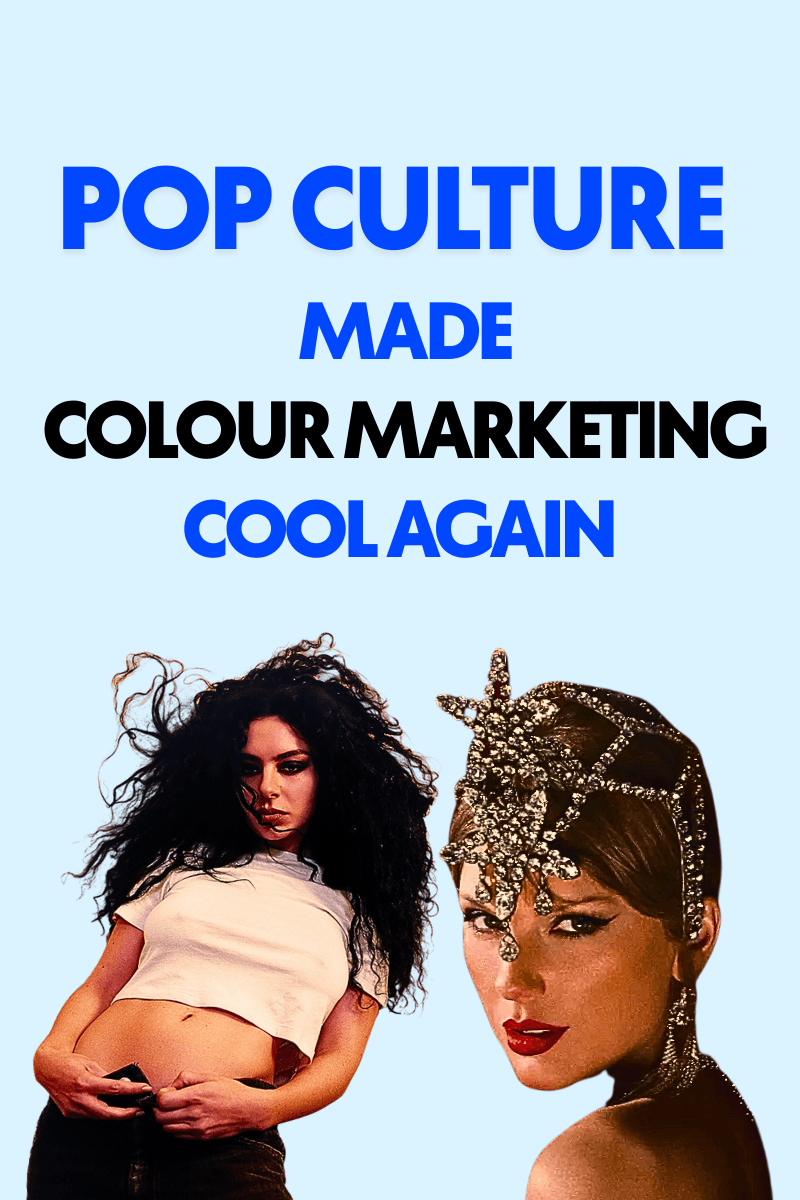
What has Taylor taught us?
You can’t sneak much past a Taylor Swift fan but even the whole internet quickly noticed colour being used as a visual cue for her latest album release. From her orange lipstick that pairs perfectly with the album cover, to her website changing to an ominous teal and orange combination – fans were quick to synonymise the colours to her announcement.
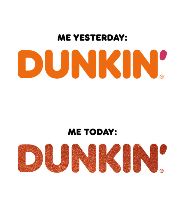
Following the release, brands naturally took to socials to get in on the hype. Some did it right, and some…not so right. It was obvious how quickly a brand could strip itself of its identity for the name of a trend, compared to those who did it tastefully. Take Dunkin’ Donuts, who playfully sprinkled glitter on its orange logo, nodding to the album without altering its DNA.
Is colour that important?
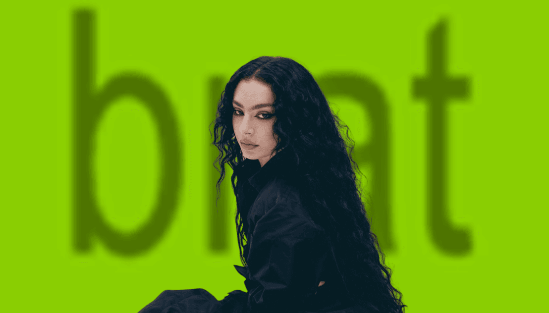
The answer is yes. This summer, it’s Taylor’s blue and orange combo but if we were to ask you what the colour of summer 2024 was, what would your answer be? The likelihood is the same green used on Charli XCX’s hit BRAT album. The same colour that had $22.5 million in media value and sparked massive search volume spikes for “Brat Green.”
Once again, a pop culture icon created a colour combination that was striking and linked it to an entire era – which meant naturally, the world did too. Suddenly there were BRAT generators, every brand was trying to figure out how to fit a fluorescent, sort-of-offensive, green into their colour palette.
All the brands that were changing their colours to be BRAT green are probably changing them to be Taylor teal as we speak. Which leads us to something very important, trendjacking.
What is trendjacking?
Trendjacking is like the person who kills the fun at a party. It is associated mostly with brands, who take a trend and try to force themselves to fit into it, even when it makes no sense. There’s a reason why this irritates audiences so much too.
Colours are part of brand identity, we know this. So when a brand is so fluid with its colours and will shed them for something fleeting like a trend, it makes us – the audience – feel like they are stepping away from who they are. As though they will easily discard their brand values, and given that this generation of consumers value brand identity way more – it’s not a good look.
What’s the psychology behind colour marketing?
Adding colour to your brand isn’t just an aesthetic choice, it drives perception and behaviour. Some quick facts about colour marketing psychology:
- 90% of snap judgments about products are based on colour
- Consistent brand colours increase recognition by up to 80%.
- 60% of brands that drastically change colour see a drop in brand recall.
It’s the same reason you will see a bold blue and yellow combination and instantly think of your favourite Swedish furniture store. You can take the logo away, and you would probably still recognise it from the colours alone.
The Key Takeaway
Marketers, you don’t need to give up your colour palette because Taylor Swift released an album. Instead;
- Use colour strategically: Align it with your brand’s DNA, tone, and story.
- Trendjacking requires subtlety: Nod to pop culture without erasing your identity.
- Consistency is key: Repeated use of signature colours builds recognition and loyalty.
- Engage audiences visually: Bold, unconventional colours drive conversation, UGC, and social sharing.
- Measure impact: Monitor how colour choices influence perception, engagement, and conversions.
Conclusion
Pop culture isn’t just entertaining, it’s teaching marketers new lessons in colour psychology, visual storytelling, and audience engagement. Taylor Swift, Charli XCX, and other artists show that a single well-chosen colour can spark a movement, make an era instantly recognisable, and inspire brands to think differently about identity.
The question for brands isn’t whether to follow the trend, but how to harness colour without losing themselves in the process.
For more blogs and posts like this, head to our Blog feed.